
________
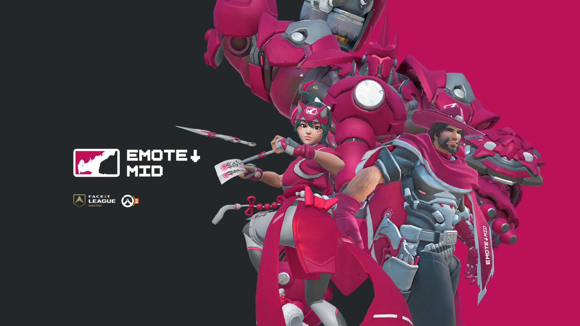
For this project, I collaborated with Emote Down Mid, an American Overwatch team competing in the Faceit Master League—the highest tier of play on the Faceit platform, just below the official Overwatch Championship Series. The goal was to develop a recognizable visual identity that would reflect both the team’s character and core values.
________
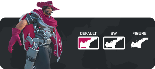
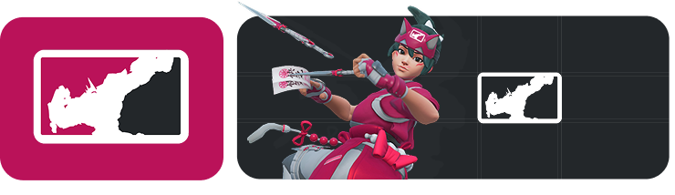
The team’s identity, reflected in the name Emote Down Mid, is inspired by the emotes and playful taunts from the game itself. Building on this concept, I designed a logo featuring a recognizable illustration of the hero Reinhardt, capturing both the spirit of Overwatch and the team’s unique character.
________
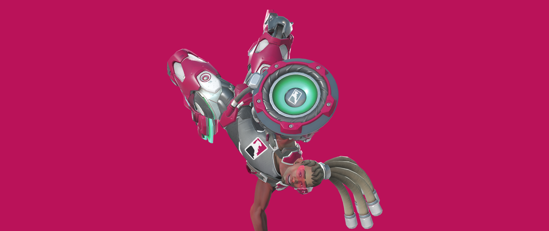
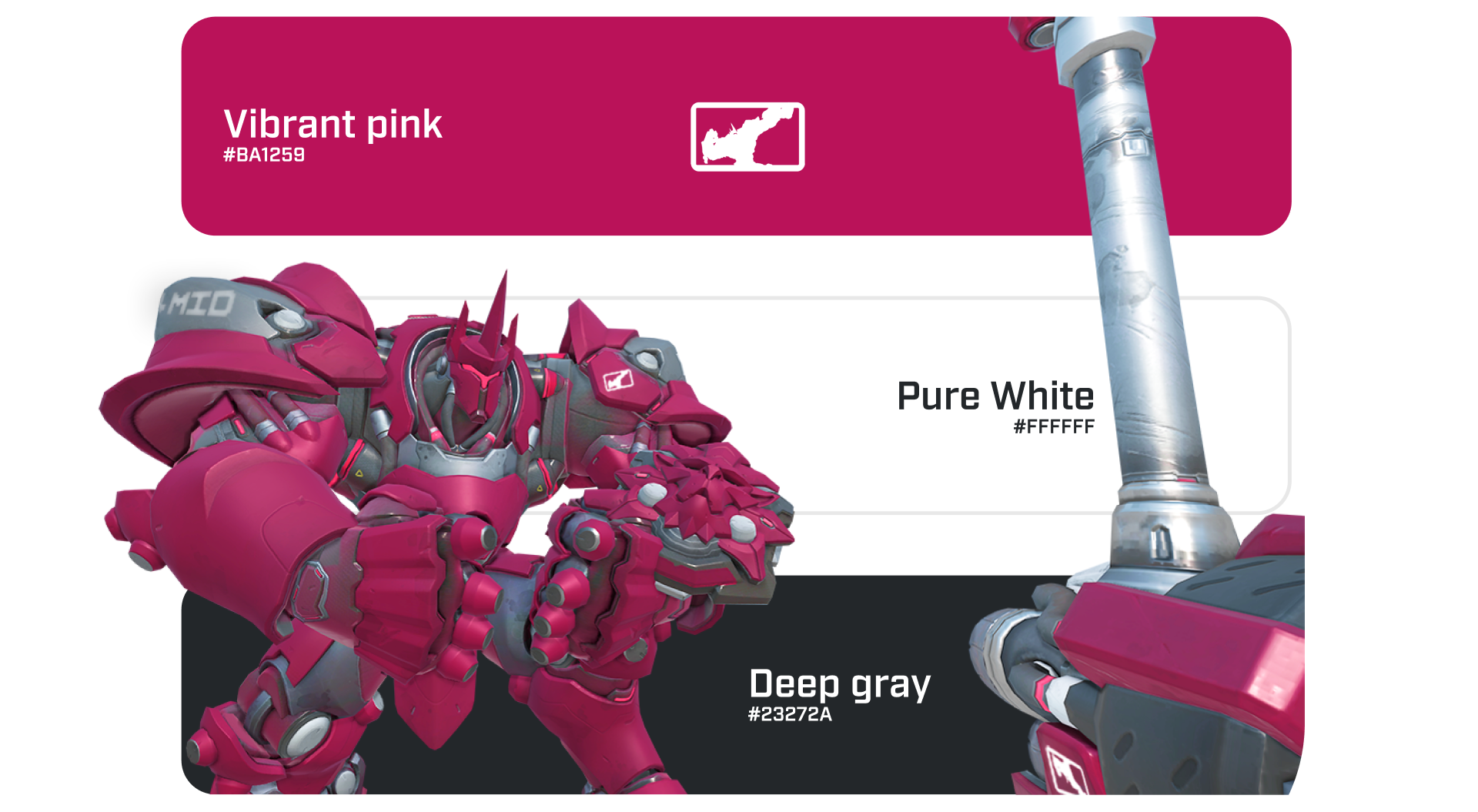
For the color palette, and to reinforce the playful “taunt” aspect of the team’s identity, the main choice was a vibrant pink, contrasted with deep dark tones and accented by a bright neon touch.